Palladium Mall, Mumbai / 600 sq.ft.
Team: Sahil Khatri , Prakriti Jain , Vritima Wadhwa
Isharya is an unconventional and contemporary high street jewellery brand that is expressive, innovative, well made and most importantly upholds the fundamental idea of affordable luxury. Resonating with these core values, Isharya’s new flagship outlet at Palladium Mumbai is a perfect blend of modern and Indian elements and materials that come together. Bolder forms, smarter details and modern materials have been infused with the brand’s older sensibilities to uplift the design language.
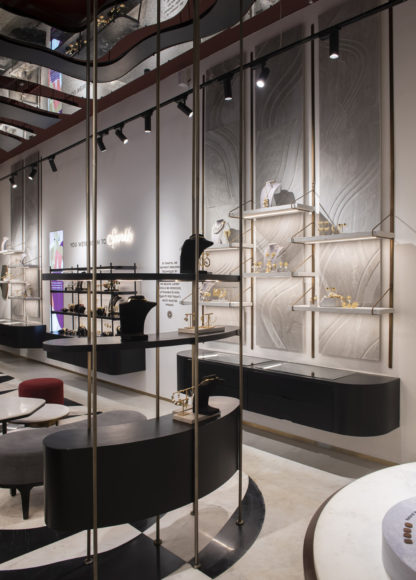
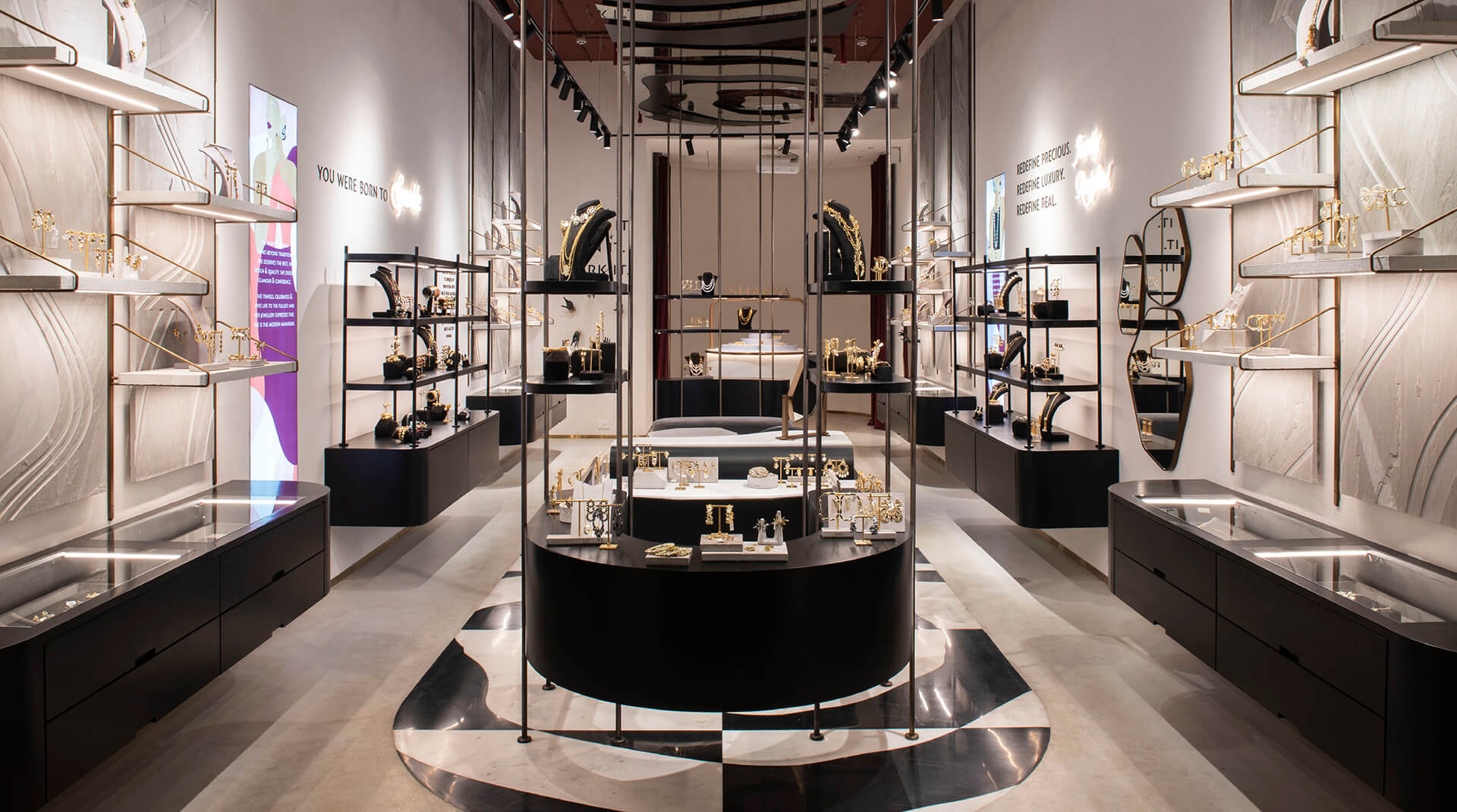
With an open facade and design language that is welcoming and less intimidating than it’s previous outlets, this 600 square feet space is fairly symmetrical. The classic displays, branding, graphics and illustrations adorn the walls on the left and right while the prime display, seating and vanity fall in the centre of the store. A curved partition functionally divides the front of the store with the back, that houses all management and storage functions including the cashier. This partition transforms the perception of space by being used to project reels from the brand’s campaigns, making the space fun and interactive. The rear end of the store also hosts the island N.O.W. bar that allows the users to personalise their jewellery.
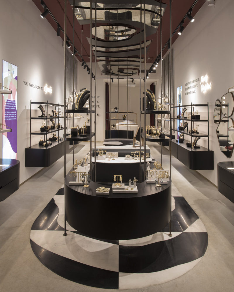
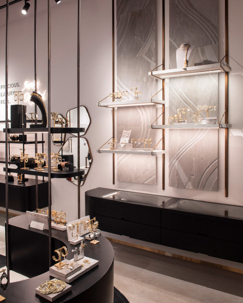
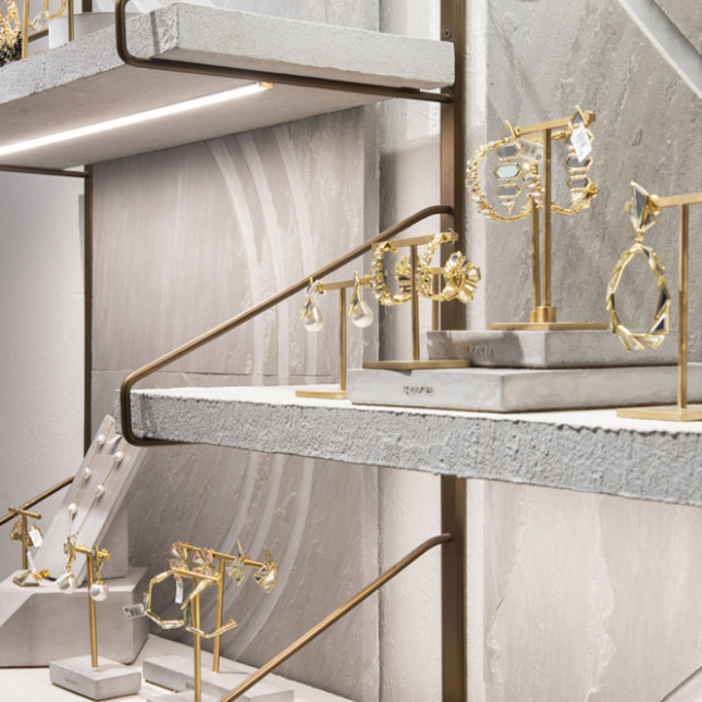
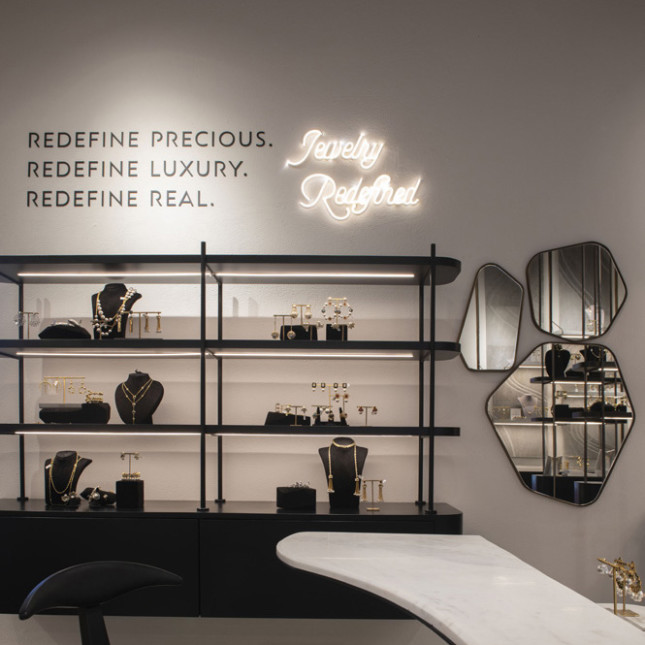
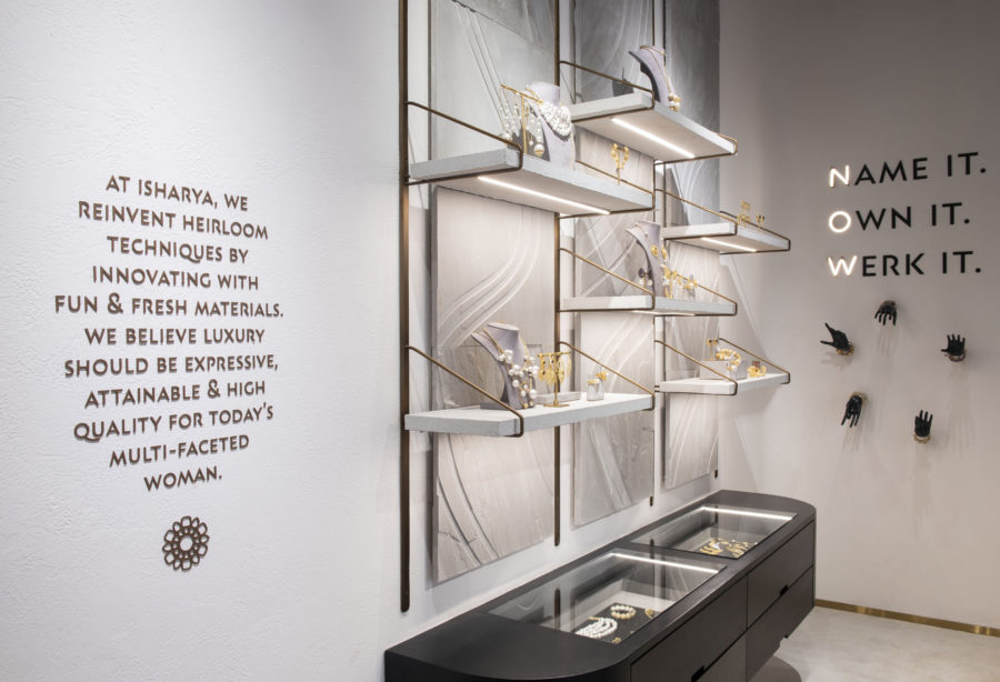
The materiality of the store is defined by a mix of local and international materials. The grey tones of the Indian khadeda used as panels on the walls and cement used as the flooring border ties in perfectly with more plush materials such as the black and white marble used in an organic pattern on the floor. While some shelving systems remain earthy in cement, the others are finished immaculately in matte black.While most vertical structures remain symmetrical and linear, the space sees a large use of organic patterns and forms in space. A large mirror installation suspended from the ceiling mimics the pattern on the floor. Vanity and wall mounted mirrors are also inspired by these organic forms originating from a ‘druzy’ illustration developed for the brand. The grey khadeda panels on the walls also display these illustrations in a subtle relief. Little accents of dull brass have been used across elements in the store to portray the element of luxury.This space narrates a strong and powerful story on who the Isharya woman is. This narrative is displayed through bold quotes, key words and illustrations scattered across the store.
