NCR / 2016 / 300 sq.ft.
Team : Vritima, Dhriti
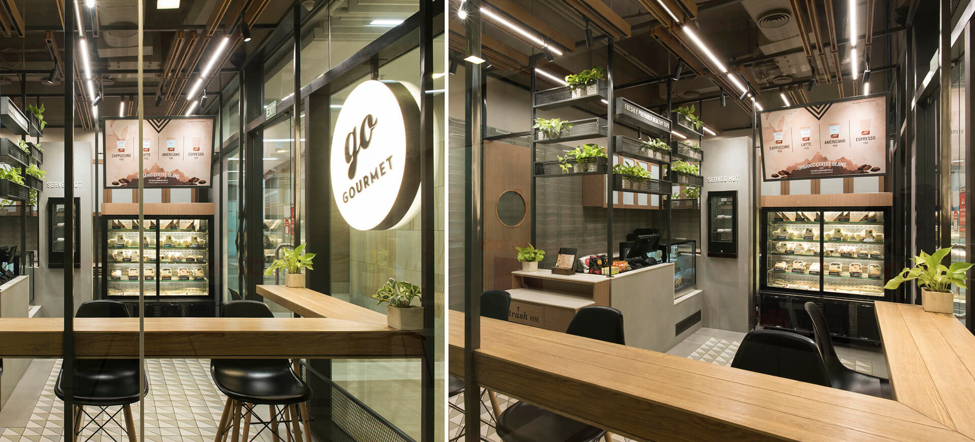
A fresh food brand, Go Gourmet caters to the growing healthy, wholesome and fresh food demand in the capital. Derived from the kiosks previously created for the brand, the layout of the store like their kiosks also follows the idea of self service. The shop flow starts from choosing your cold/hot food, choosing the beverage to a point of sale and then seating.
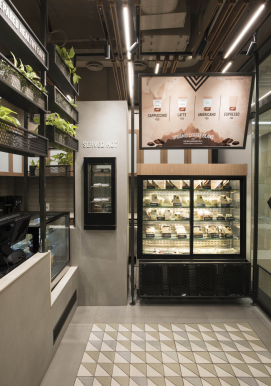
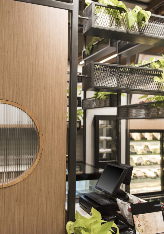
Modularity a fundamental starting point for the brand, directed us to break the space down into a grid. A metal structure using square pipes and perforated screens was built around this grid-smartly partitioning the front and back of the house and was also used to create the ceiling grid.
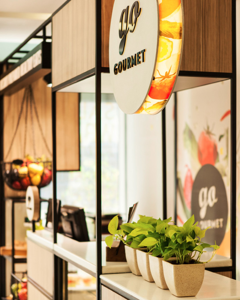
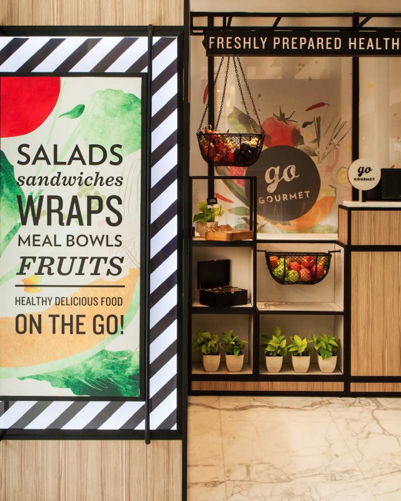
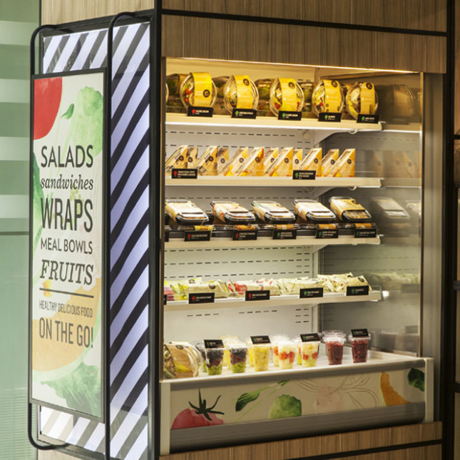
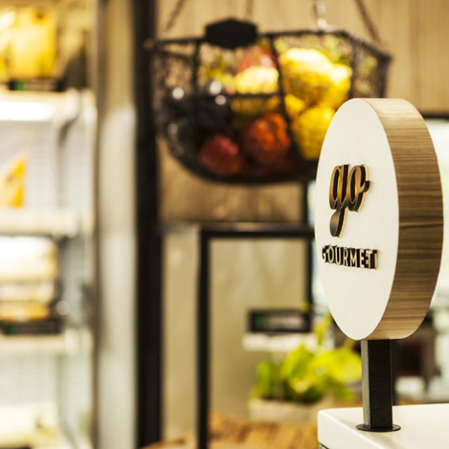
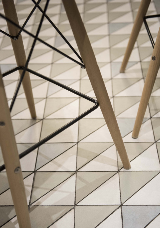
Quality materials, textures, muted colour tones and simplicity define this small space. A patterned floor using white, grey and green triangular tiles balance the seamless surface on the counter. Oak wood details in tables, cabinetry and other furnitur pieces add warmth to the space. The backdrop of the kitchen is highlighted with green subway tiles, oak wood and fluted glass cabinetry. The lighting system is a combination of linear washers and spots that highlight the vertical racking system. The metal shelving, muted tiles and a warm oak wood palette come together beautifully to emphasize on the gourmet values of this QSR. Indoor planters have been used to add a sense of freshness to the space. Unlike other QSR’s, Go Gourmet caters to the growing health conscious market and the retail language is aimed at supporting this value.
