New Delhi / 2019 / Area 10,800 sq. ft.
Team : Vritima Wadhwa, Sahil Khatri, Nida Ansari
Shantanu & Nikhil launched their label in 2000 and have been breaking stereotypical notions of fashion since. Their new age, contemporary and bespoke fashion label aims at reaching out to a global audience through a modern interpretation of Indian ethnic wear. Deeply inspired by human behavior and emotions which are expressed through their clothes – they’re a brand that represents strong individuals who fight for what they believe in.
In 2019 we were honoured when they approached us to design their new 24,000 sq.ft. headquarters and factory in Noida, India. The project involved creating a multifunctional space that not only reflected the brand’s vision for the next 20 years but also served as a symbol of creative stimulation, participation and business transparency. The structure, a total of six stories, would house all the business functions, a dedicated design department and an end-to-end production wing for Apparel, shoes and Accessories.
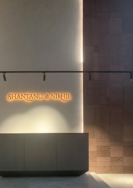
The vision for Shantanu & Nikhil’s factory was to create a work and production space that is organised in functions, non-hierarchical in layout, harmonious and most importantly represents the brand through a design language that is based on ‘Impactful Minimalism’. We defined ‘Impactful Minimalism’ as creating powerful compositions using minimal elements and efficient materials.
Working with a palette that was low cost, using a design philosophy that resulted in little to no wastage and most importantly upcycling elements from their prior workspace. One of our goals as a Studio was to learn the power of using raw, readily available materials to create a bold and empowering space that harnesses the sense in simplicity. Our biggest challenge was to do this under a limited budget while not compromising on the vision of a singular hub.
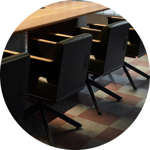
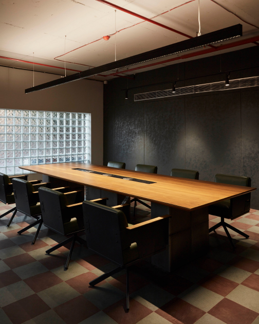
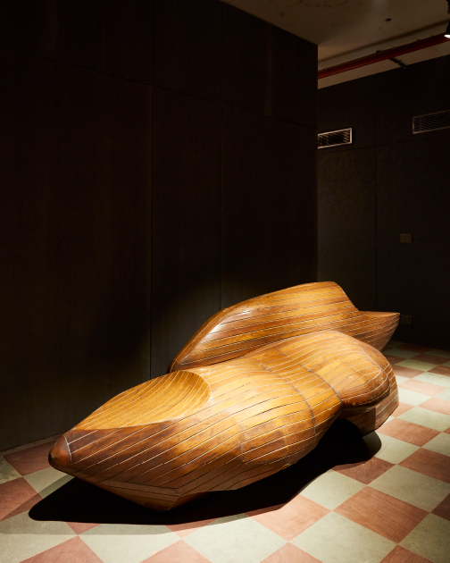
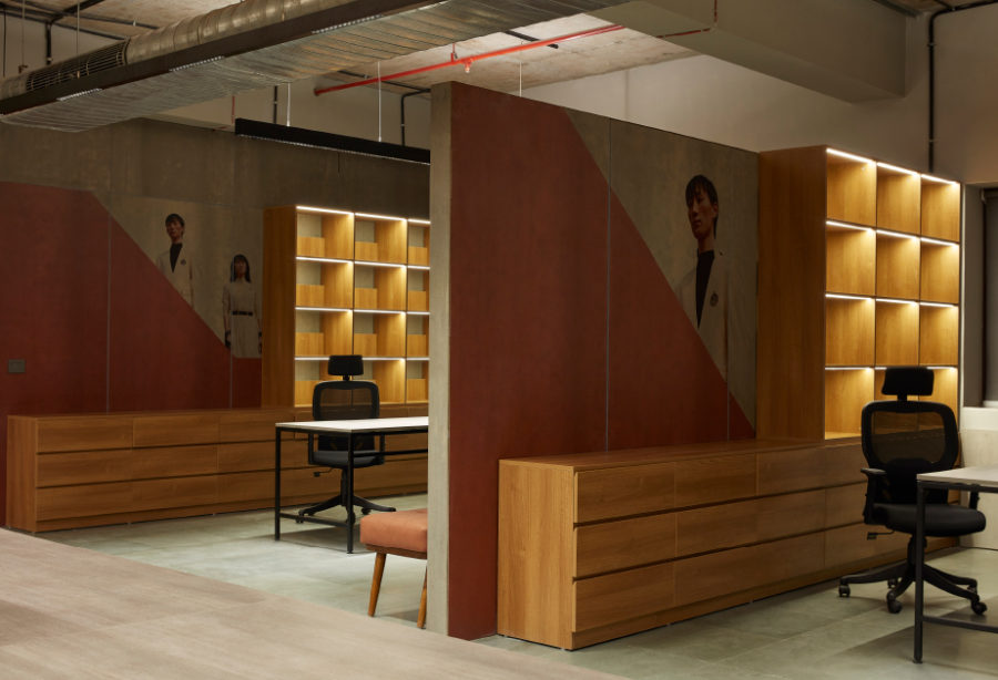
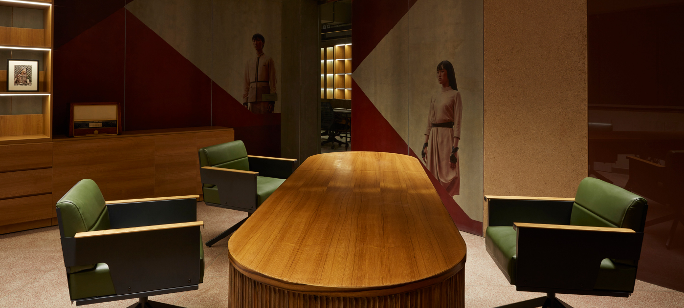
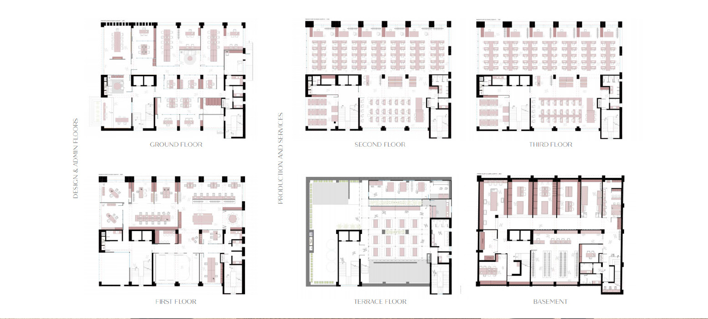
The final layout housed the Design, management and other administrative functions on the ground and first floor with the maximum design interventions while production and other technical services span across the other floors - basement, second, third and terrace. Transparency and seamlessness are key attributes of the layout - with open cabins for their senior members, large community workstations and breakout zones and event’s spaces. The use of large open spaces with common desks and an open plan philosophy encourages conversations, allows for freedom to work and inculcates a sense of partnership.
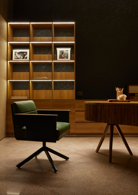
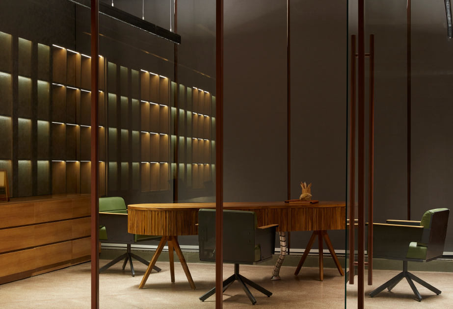
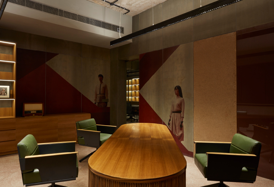
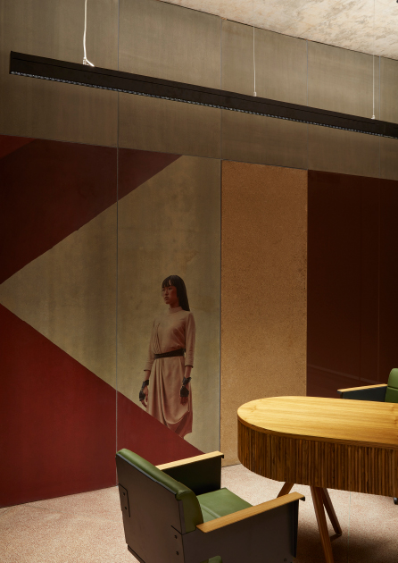
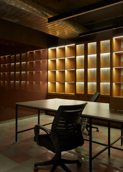
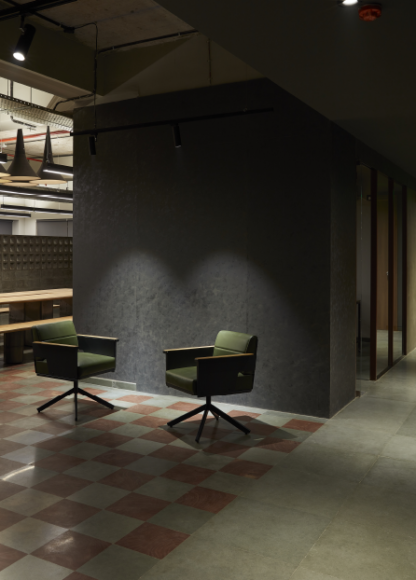
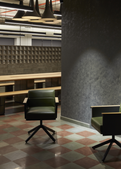
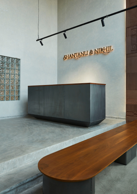
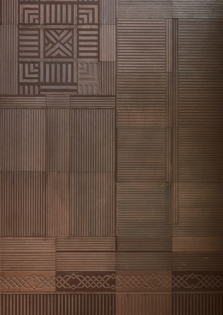
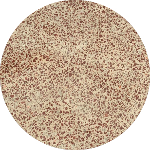
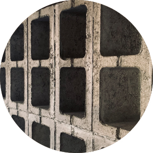
The material palette comprises locally sourced kota, red Mandana, Gypsum boards with life size graphics, cement Terrazzo, and subtle paint finishes. The brand colour - a Marsala red is bold and makes a statement in many forms - from the intricately etched double height stone wall at the foyer, the chequered patterned floors in dense work zones to the red terrazzo chip floor in the cabins and even makes its way on to the verticals of the partition system. Seen sparingly yet impact-fully are the square concrete blocks and glass blocks that reinforce the square grid seen on the floor.
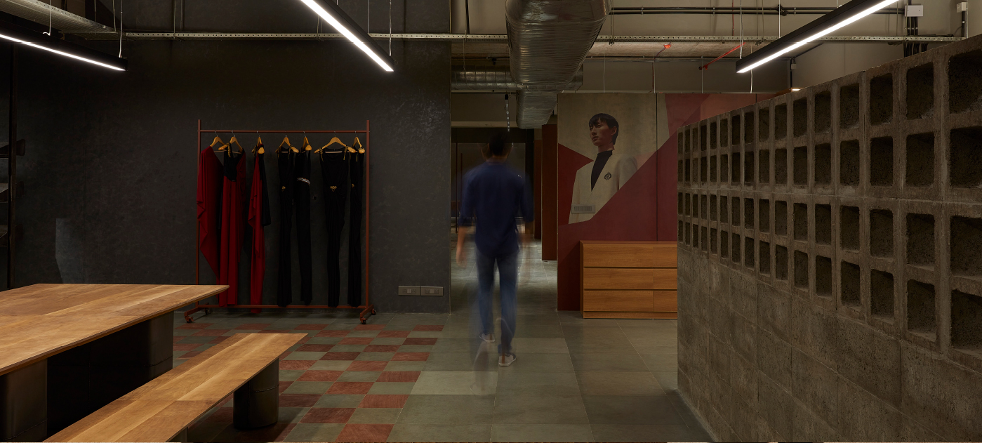
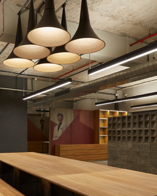
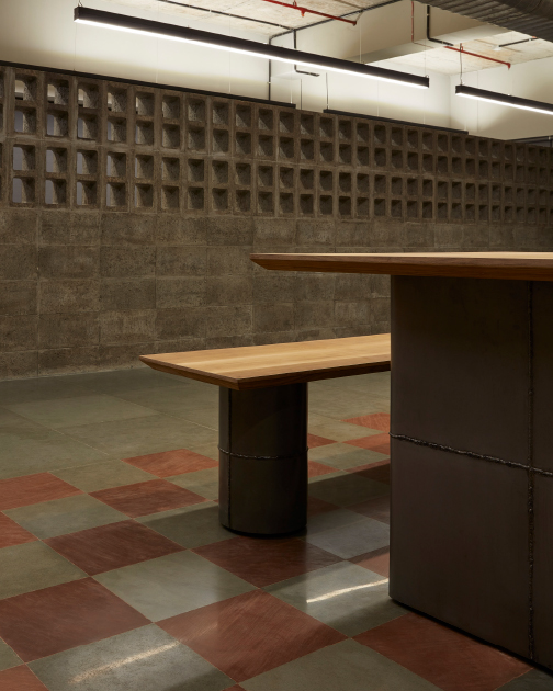
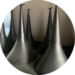
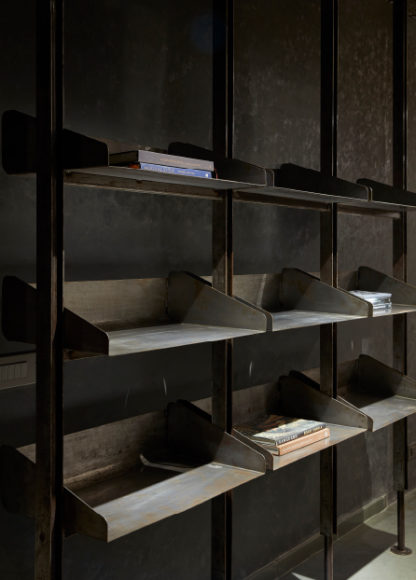
The lighting system is a balance of task and ambient lights consisting largely of linear fixtures. Statement lights and pieces from their older stores and workspaces have been up-cycled to fit in here. With most services and details being exposed, the space is reflective of the context of an industrial setup. Our space is minimal, raw and is devoid of superficial elements of stylisation. This workspace we believe inspires their team to have a revolution in thought. Shantanu and Nikhil symbolise progressivism and distinctiveness and their new workspace resonates with these qualities.
